I just realized something kind of breathtaking in its awesome boneheadedness.
The “Desktop” folder in Windows has always been a troublespot for them, conceptually. They do their level best to convince you that the Desktop is actually the “top” of your whole computing tree, but that’s materially not true; actually, the “desktop” is just a folder in your user directory. Drill far into down, and you’ll find that the “desktop” Windows Explorer shows you at the top will contain, inside a nest of other folders, itself.
Yeah, turtles all the way down. I’m sure that’s NEVER confused anyone.
Well anyway, I work off the desktop, mostly, in my Windows VM. I drop working files there, so I interact with it quite often. I keep little in the VM long-term, so I don’t want things getting filed away in My Documents or whatever where out of sight becomes out of mind.
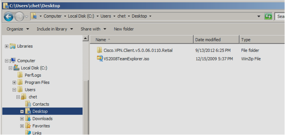
It turns out that if you drill down to the desktop normally — usually, by choosing “Computer” and then “C:” and then “users”, then your username, and then “desktop” — you see pretty much the correct contents:

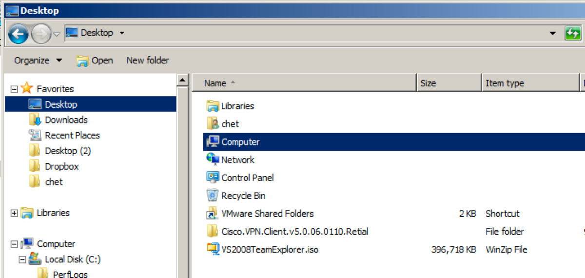
But if you make the Desktop folder a favorite by dragging it to the navigation bar in Windows Explorer, it apparently becomes the MAGIC DESKTOP, and Microsoft helpfully adds a bunch of other clutter:

Look! Extra shit in one view that’s missing in the other — in what should be exactly the same view. Nice.
There does not, by the way, appear to be a way to:
a. Remove these stupid extra links; or
b. Create a “favorite” link to my desktop folder that doesn’t include them.
And they wonder why people hate Windows.
There’s a thing in computing called “the principle of least surprise.” It’s the idea that, when you’re building a system, you don’t want to shock the user with unexpected behavior. This is an excellent example of a violation of that rule, and of the kind of bullshit that happens when you design by committee.
